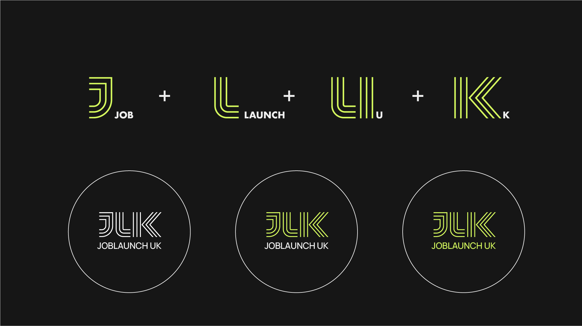
JOBLAUNCH UK
Boosted customer inquiries by 55% with a website revamp.
Year:
2026
INDUSTY:
Ed Tech & Career Development
Client:
SHOKI

Project Overview
JOBLAUNCH UK is a UK-based career services platform focused on supporting individuals — particularly international students and early professionals — in navigating employment opportunities with clarity and direction.
The objective of the project was to develop a structured and professional brand identity that reflects credibility, guidance, and long-term growth. The visual system needed to communicate trust while remaining modern and approachable for a young, ambitious audience entering the job market.
The final identity was built around clarity in typography, disciplined layouts, and a confident visual tone — positioning JOBLAUNCH UK as a reliable career partner rather than just another job assistance platform.

DESIGN CHALLENGE:
JOBLAUNCH UK required a distinctive and modern brand identity that reflects clarity, direction, and structured career growth.
As a career services platform supporting students and early professionals, the brand needed to communicate trust and guidance while standing apart from generic job portal visuals.
The challenge was to design a logo that:
• Represents forward movement and career progression
• Reflects integration between opportunity and talent
• Feels modern, intelligent, and digitally adaptable
• Maintains clarity and scalability across platforms
The identity needed to resonate with ambitious individuals while reinforcing credibility within the UK employment landscape.
CREATIVE APPROACH & THINKING:
The creative direction for JOBLAUNCH UK was built around the idea of structured progression.
Instead of using common career symbols, the identity was developed as a custom linear monogram derived from the initials JLUK, creating a modern and system-driven visual presence.
The parallel line construction represents direction, continuity, and forward movement — aligning with the platform’s role in guiding career growth.
A key design decision was merging the letters L and U, symbolizing the integration between opportunity and talent. The forward-angled strokes in the K introduce momentum, reinforcing progress and advancement.


Client's Word

Projects
other